Microsoft unveils new logo in 25 years
Updated: 2012-08-24 04:39
(Xinhua)
|
||||||||
 |
|
The redesigned Microsoft logo is shown in this publicity image released August 23, 2012. Microsoft Corp unveiled its first new logo in 25 years on Thursday as it looks to unify its branding ahead of a clutch of new product releases this year. [Photo/Agencies] |
SAN FRANCISCO - Microsoft on Thursday unveiled a new corporate logo, the software giant's first such facelift in 25 years, in attempts to project an impressive image ahead of the launch of a wave of major new products later this year.
The new logo consists of a symbol of four colored squares, and the "Microsoft" name in the so-called Segoe font.
It will gradually replace the old logo the company has used since 1987, which is mainly the "Microsoft" name in bold and italicized typeface without any symbol.
"It's been 25 years since we've updated the Microsoft logo and now is the perfect time for a change. This is an incredibly exciting year for Microsoft as we prepare to release new versions of nearly all of our products," Jeff Hansen, Microsoft's general manager of brand strategy, said in a post on the company's blog.
"This wave of new releases is not only a reimagining of our most popular products, but also represents a new era for Microsoft, so our logo should evolve to visually accentuate this new beginning," added Hansen.
Microsoft on Thursday unveiled the new logo in three of its retail stores in eastern and western regions in the United States. It already appears on the company's website Microsoft.com.
The new logo will be used in all Microsoft stores in the next few months, and will be featured in all of Microsoft's television ads globally, the company said.

 Relief reaches isolated village
 Rainfall poses new threats to quake-hit region
 Funerals begin for Boston bombing victims
 Quake takeaway from China's Air Force
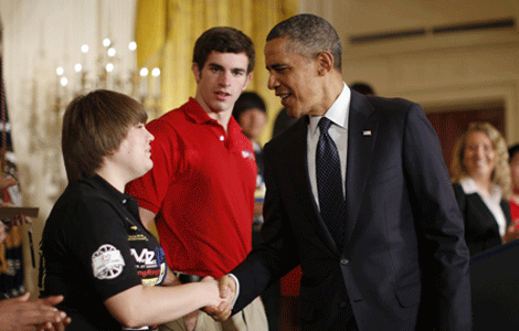 Obama celebrates young inventors at science fair
 Earth Day marked around the world
 Volunteer team helping students find sense of normalcy
 Ethnic groups quick to join rescue efforts
Most Viewed
Editor's Picks

|
|

|

|

|

|
Today's Top News
Health new priority for quake zone
Xi meets US top military officer
Japan's boats driven out of Diaoyu
China mulls online shopping legislation
Bird flu death toll rises to 22
Putin appoints new ambassador to China
Japanese ships blocked from Diaoyu Islands
Inspired by Guan, more Chinese pick up golf
US Weekly

|

|